A Fresh Look for Lettering Works
After some years in business, things change, you grow and evolve - it might be time to consider a brand refresh to ensure your business’ visual identity is evolving along with you. Three years ago, Lettering Works began as an idea for a card design company and has since evolved to encompass many aspects of branding, campaign design, consulting, and custom graphic design. In planning for the new year and working one-on-one with many other local business owners, organization leaders, and artists, it hit me that it might be a good time for an evaluation of my own brand.
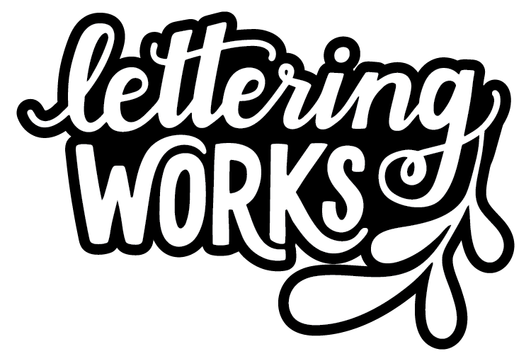
I started by reflecting on my logo. Logos are one of the most simple representations of a brand. I don’t feel like there is anything inherently wrong with my original logo. But I felt it was time for a refresh that brought the visual identity of my business up to speed with where I am at with my business. I wanted to create something that parallels the professionalism, quality, and intention that is present in my work.
I’ve been asked plenty of times “how do I know if I need a new logo?” My response is typically “does your logo reflect your current personality, style, and place in business?”
When small businesses or artists start out - it can be much easier to opt for a DIY logo. The fear of investing too much with limited startup cash or security of a solid cash flow is real. This can lead to a less-than-ideal logo that functions, but doesn’t work to its full potential. (Sidebar: if this resonates with you, then it might be time for a rebrand!)
Three years into business felt like a great time for me to be honest and critical of my brand - but also commit the needed time to redevelopment. It’s always easier to work in your business rather than on it. Even the simplest of logo tweaks can be hours of work. It is a commitment, but a necessary one. The logo updates for Lettering Works took a full weekend with several variations and tweaks along the way until I landed on something that I felt best represented my business.
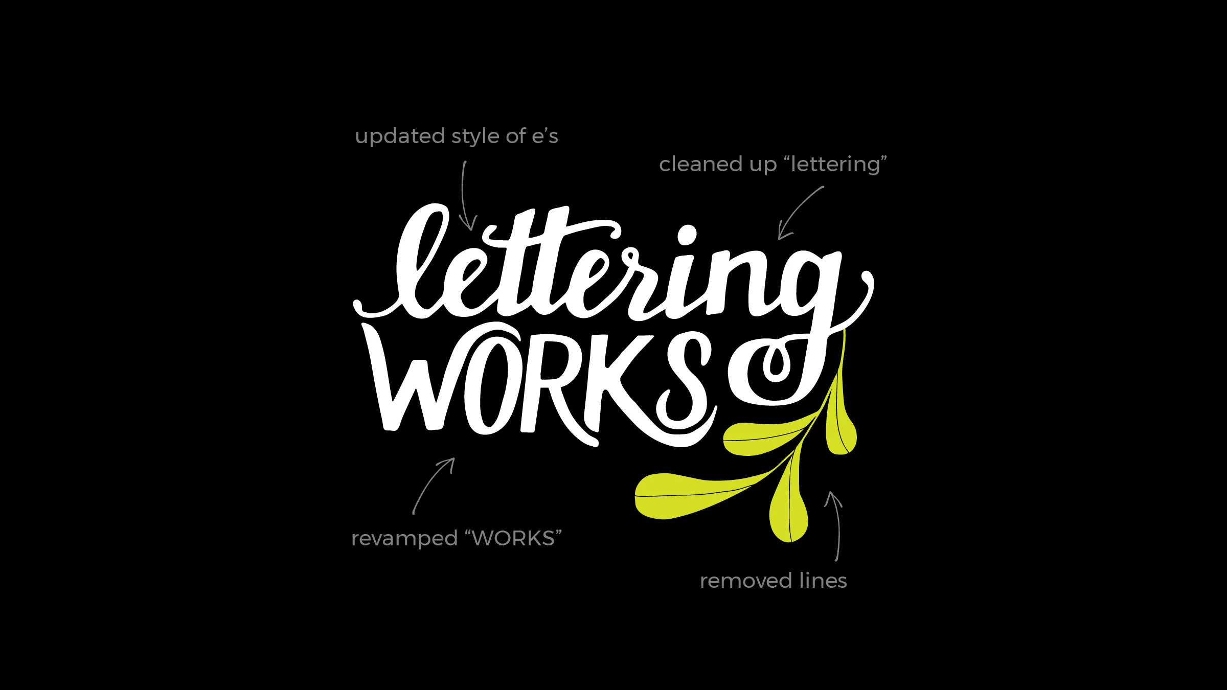
I made four significant changes to the logo:
• Updated the e’s to a more modern calligraphy-esque style
• Cleaned up “lettering” by improving the uniformity of the slant of letters and line thickness
• Revamped “WORKS” to communicate a more bold, confident, and refined look
• Removed lines on leaf to enhance its simplicity and boldness
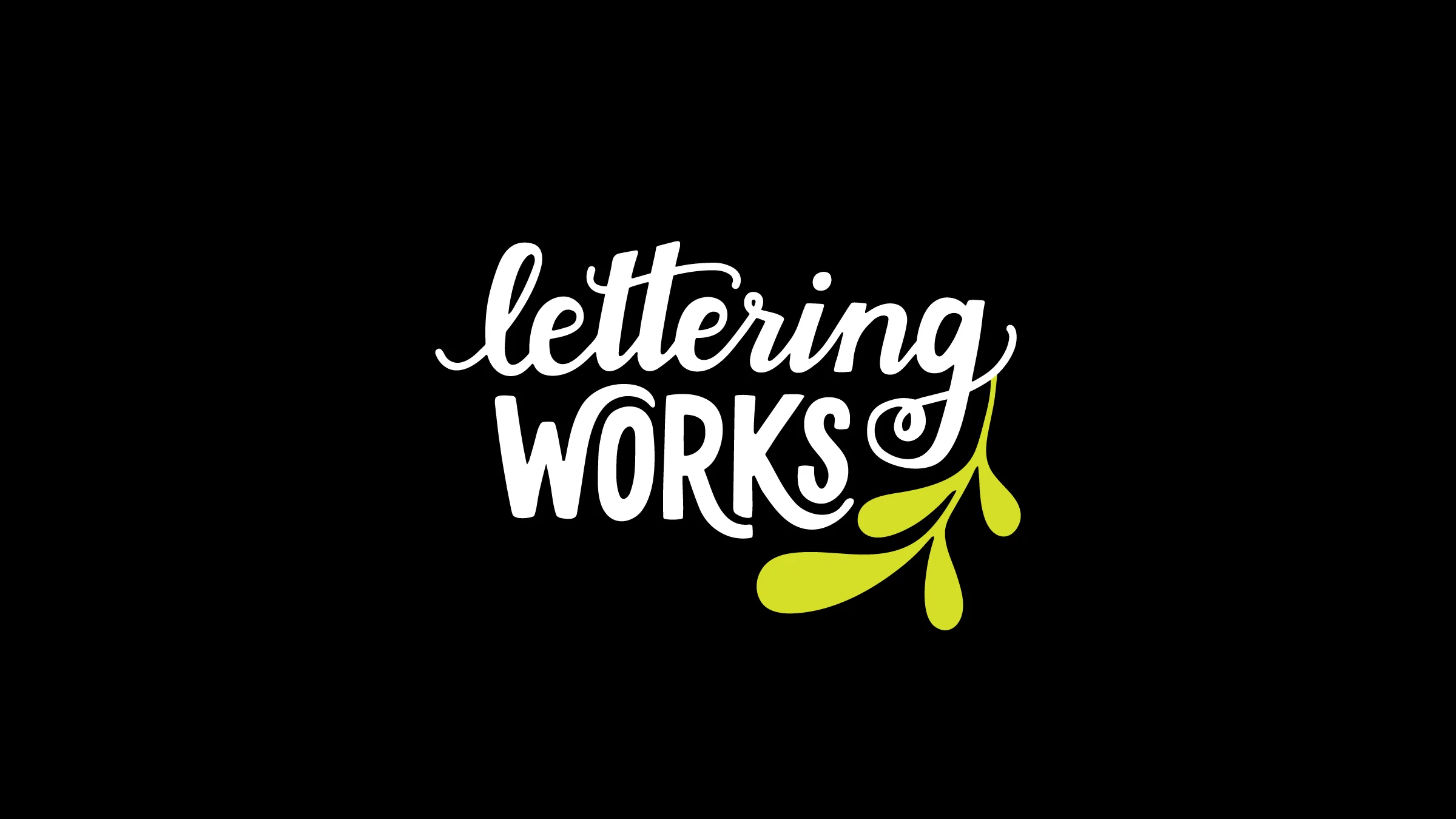
Overall, I worked towards developing a more compact, confident, and intentional mark that aligns with what Lettering Works stands for - quality branding. This evolution reflects the development of the brand overtime while paying tribute to the original design. What do you think of the new look? I’d love to hear your thoughts!
And if you are in the market for a fresh new look for your business, get in touch!


