Lettering Works Talks Logos
A logo sets the tone for a brand and is often the first touch point when someone encounters a business. Partnering with a designer whose style aligns with your vision for your brand and whose ideas you trust is essential for developing the brand (or rebrand) that will best serve you.
Lettering Works loves bringing brands to life through custom logos, business cards, brand graphics, strategic guidelines, and more. So much goes into building a brand for success.
To provide some context and insight to some of our favorite logo projects, we are highlighting the 5W’s of each: who, what, when, why (this design), and where.
The Billboard Bistro
Who: Randy + Debbie Bassette
What: A newly remodeled bar-turned-bistro
When: 2019
Why (this design): The Billboard Bistro needed a modern, inviting look to replace it’s old name (The Local) and look that was managed by previous bar owners. Our type-focused design helped the name stand out against its physical billboard background that towers over the bistro itself.
Where: Bartonville, Illinois
Haynes Family Chiropractic
Who: Christine + Kyle Haynes
What: Family Chiropractic Office
When: 2019
Why (this design): The Haynes heavily utilize Blair Upper Cervical Technique, which incorporates the brain. In most logos for chiropractic practices, a spine is the main visual representation. The custom-drawn brain gives this small, family-run practice something unique to represent themselves.
Where: Peoria, Illinois
309 Cultures
Who: Joe Zich, Easy Going Plant Based
What: Line of fermented foods
When: 2018
Why (this design): The inclusion of “309” references Peoria’s zip code. Making the “309” most prominent affirms that it is deeply rooted in Central Illinois. The incorporation of the silhouette of IL further highlights the locational importance. The hand-drawn type fits the handmade nature of the product.
Where: Peoria, Illinois
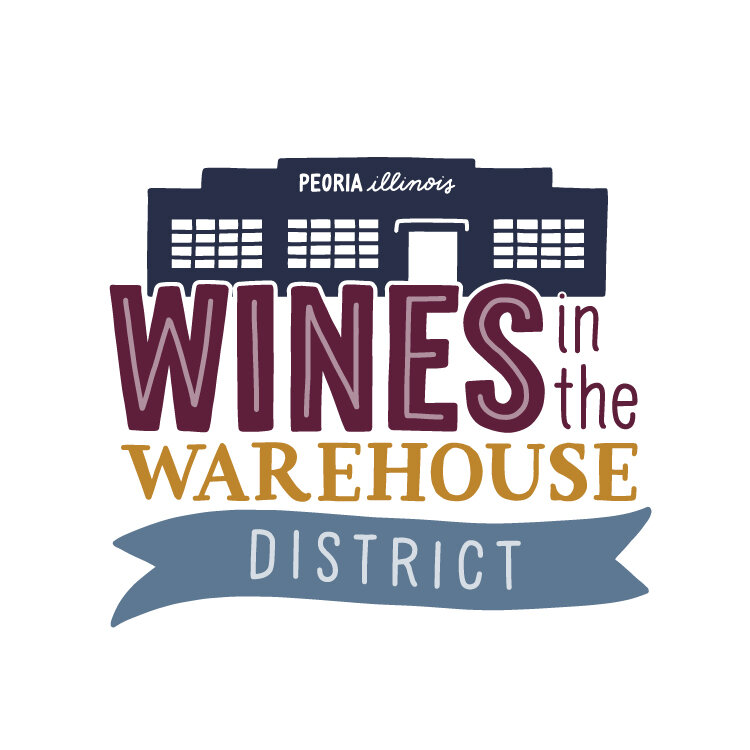
Wines in the Warehouse District
Who: Easter Seals of Central Illinois
What: Summer Fundraising Event
When: 2019
Why (this design): A mix of lettered styles and a warehouse building illustration help ground the aesthetic and brand in the Warehouse District, where the event is planned to be held for years to come. The rebrand helped bring a new energy to the event formerly known as “Wines and Polo on the Prairie.”
Where: Peoria, Illinois
Wild Peoria
Who: Botanical Illustrator Peggy West
What: Botanical Illustrations + Letterpress Originals
When: 2018
Why (this design): The simple hand-drawn type pairs well with the custom botanical illustrations that hint at the wide range of illustrative work that Peggy does.
Where: Peoria, Illinois
Peoria Public Art
Who: Peoria Public Art - Artist Collective
What: Artist Collective painting murals in Peoria
When: 2018
Why (this design): The bold, illustrative P mimics the bold mark the collective artists worked to make on Peoria. The design system allowed for the “P” to be replaced with images of the artists, their work, and progress from the projects.
Where: Peoria, Illinois
The Marty Monologues
Who: Marty Wombacher
What: Touring one-man show
When: 2018
Why (this design): Marty is the star of the show, so it was essential to give him the spotlight in the logo design as well. A hand-drawn caricature sits on top chunky, playful lettering that parallels Marty’s quirky personality.
Where: Peoria, Illinois
Julie Dodge Photography
Who: Photographer Julie Dodge
What: Nature Photography
When: 2018
Why (this design): Much of Julie’s work features trees and nature - this simple line illustration of a tree captures the essence of her nature photography.
Where: Peoria, Illinois
Zandra Illustration
Who: Artist Zandra Conley
What: Children’s illustrations, cute pins and merchandise
When: 2019
Why (this design): The playful and chunky hand-drawn type matches Zandra’s fluffy characters.
Where: Whitehall, Pennsylvania
If you think we’d be a good fit to take your business or brand to the next level, we’d love to chat! Send us a message via our contact form to get started.
ABOUT THE AUTHOR
Chelsie Tamms is an award-winning lettering artist and designer based out of Chicago. She is the owner of Lettering Works, a branding studio that connects businesses to their audience through creativity and strategy. With over 10 years of practice of lettering and design, Chelsie is passionate about craft and intention. When she’s not designing, she can be found eating ice cream, traveling internationally, or starting a new passion project.


