The Secret to Making Your Business Cards Stand Out
Have you ever heard the phrase, “don’t judge my business card… I’m getting new ones soon.” from someone at a networking event as they slip their card into your hand? Did it make you feel incredibly awkward and maybe even start to question other aspects of the person handing it to you? Or maybe you were the one who said it?
When you hand someone your business card or receive a card from someone, it should be a positive, confidence-filled experience. This little card is a representation of your business, an extension of who you are. Start by asking yourself what it says about you. What does it communicate to someone who has never met you before? How about someone who knows you well? Is your business card doing your brand (personal or business) justice?
I know I’m not the only one who has a large stack of unimpressive business cards I’ve received over countless networking events uselessly tucked away in a drawer. What can you do to make your card stand out from the crowd and spark meaningful connection, that might even lead to a sale?
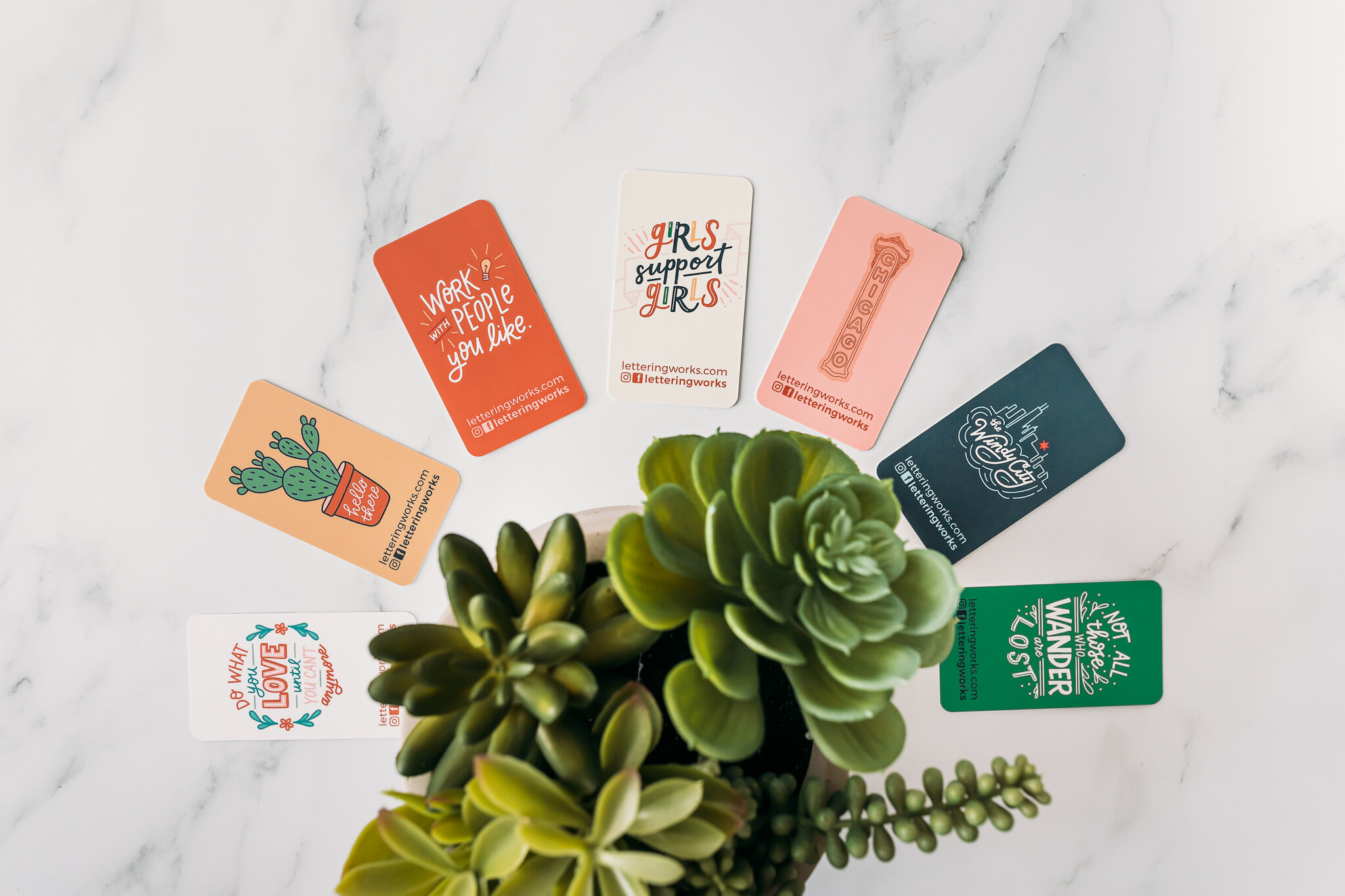
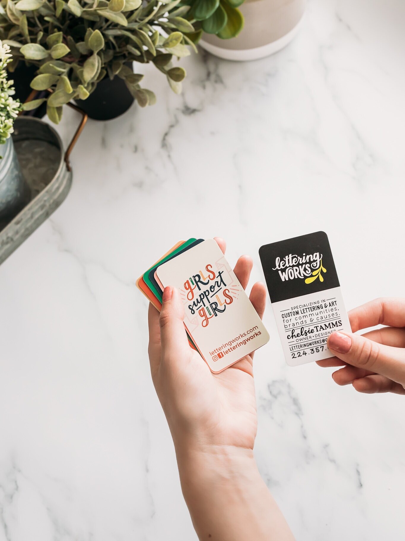
My answer to this question is simple: design a high-quality business card that you are truly proud to hand out. For me, that means a card with a soft matte-touch finish, rounded corners, seven variants of artwork on the backs, and a consistent front that details all my information.
My business cards make me feel excited that I can quickly show off my work by fanning out mini pieces of artwork and allowing a new connection to choose their favorite card. My strategic approach allows for a more interactive and delightful process, rather than an awkward one. And I feel confident in clearly communicating what I do quickly and effectively with my thoughtfully designed cards.
I get a LOT of positive feedback on my cards because they surprise and delight. Some people are excited to hang a new little work of art by their desk. Others are surprised they can take one because they “seem too nice” and I can see that they are thinking about what they want to do with it. I love these responses because I know my investment in a high quality card is paying off. It won’t be added to the drawer filled with unimpressive cards or, worse, thrown in the trash. Allowing the artistic work itself to be the hero makes for a more valuable business card, but the information is right there on the other side, always available when needed.
So what exactly is the secret to making your business card stand out? Think of your little 2x3.5’’ canvas as an opportunity to show the value you can provide. Stand-out cards can all look different, but they have a couple key things in common: they are engaging, they are valuable in the eyes of recipients, they show off what you do (not just tell you where to find your work and/or how to contact you). Whether you cover one side with artwork, a coupon, a pro tip, or something else that’s completely out-of-the-box and creative, you want to design something that is memorable and unique to you and your brand.
The best part of having a business card that you are truly proud to hand out is that the confidence you build translates to so much more - like actually believing in what you are doing so you can sell your services or products. Imagine having an easier time talking about what you do all because you started the conversation off with confidence. That’s the power of a well-designed business card.
Ready to level up your Business cards?
If you’d like to level up your business card game and have something designed that makes you feel good and attracts others to want to work with you, send me a message via the Lettering Works contact form. I love building business owners’ confidence through thoughtful and strategic design.
Lettering Works loves bringing brands to life through custom logos, brand graphics, strategic guidelines, and more. So much goes into building a brand for success, including thinking about one of the smallest of your brand touchpoints: the business card.
ABOUT THE AUTHOR
Chelsie Tamms is an award-winning lettering artist and designer based out of Chicago. She is the owner of Lettering Works, a branding studio that connects businesses to their audience through creativity and strategy. With over 10 years of practice of lettering and design, Chelsie is passionate about craft and intention. When she’s not designing, she can be found eating ice cream, traveling internationally, or starting a new passion project.


